Data visualization has become one of the most important aspects of modern communication, research, business analysis, education, and decision-making. Whether people are studying scientific trends, comparing business performance, analyzing survey responses, or interpreting academic research, visual graphs make information easier to understand. Among the most commonly used visual tools are histograms and bar graphs. Although they may appear similar at first glance, they serve very different purposes and are used for different types of data. This is why the topic “histogram vs bar graph” is one of the most searched educational concepts among students, analysts, teachers, researchers, and professionals.
Understanding the difference between these two graph types is extremely important because using the wrong graph can lead to confusion, inaccurate interpretation, or misleading conclusions. Many beginners mistakenly believe that histograms and bar graphs are interchangeable simply because both use rectangular bars to represent information. However, their structure, purpose, spacing, data representation, and interpretation methods differ significantly.
A histogram is primarily used to display the distribution of numerical or continuous data. It helps viewers understand patterns such as frequency, variation, concentration, and shape within a dataset. A bar graph, on the other hand, is used to compare categories or groups of data. It allows viewers to visually analyze differences between separate classifications or labels.
In statistics, mathematics, business intelligence, social sciences, economics, engineering, and many other academic fields, choosing the correct graph is essential for accurate communication. Professionals rely heavily on data visualization because humans naturally process visual information faster than large tables of raw numbers.
This detailed guide explores everything about histogram vs bar graph, including definitions, characteristics, differences, similarities, examples, advantages, disadvantages, real-world applications, common mistakes, and practical tips for choosing the right visualization method.
What Is a Histogram?
A histogram is a graphical representation used to organize and display the frequency distribution of continuous numerical data. In simpler terms, it shows how often certain ranges of values occur within a dataset.
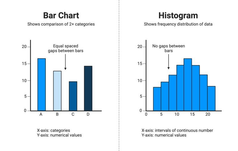
The bars in a histogram represent intervals or “bins” of numerical values. These intervals are connected without spaces because the data is continuous and related.
For example, imagine a teacher wants to analyze exam scores for 200 students. Instead of listing every individual score, the teacher may group scores into intervals such as 0–10, 11–20, 21–30, and so on. A histogram visually displays how many students fall into each score range.
Histograms are extremely useful for identifying patterns within datasets. They help reveal whether data is evenly distributed, concentrated around specific values, skewed toward one side, or spread widely across multiple ranges.
One important concept in histogram analysis is frequency distribution. Frequency refers to how many observations fall within each interval. The height of each bar represents the number of observations in that range.
A histogram also helps identify statistical patterns such as:
- Normal distribution
- Skewness
- Peaks and clusters
- Outliers
- Variability
- Data spread
Because histograms focus on continuous data, the bars touch each other. This visual connection indicates that the numerical ranges are part of one continuous measurement scale.
What Is a Bar Graph?
A bar graph, also known as a bar chart, is a visual representation used to compare different categories or groups. Each bar represents a separate category, and the height or length of the bar indicates the value associated with that category.
Unlike histograms, bar graphs deal with categorical or discrete data rather than continuous numerical intervals.
For example, a company might use a bar graph to compare sales performance across different product categories such as electronics, clothing, furniture, and sports equipment. Each category is independent, so spaces appear between the bars.
Bar graphs are extremely effective for comparisons because they make differences between groups visually clear and easy to understand.
The categories represented in a bar graph may include:
- Countries
- Age groups
- Product types
- School subjects
- Survey responses
- Departments
- Sports teams
- Income levels
One major advantage of bar graphs is flexibility. They can be displayed vertically or horizontally depending on the presentation style and available space.
Bar graphs are widely used in:
- Business reports
- Marketing analysis
- Educational presentations
- Government statistics
- Social science research
- Financial analysis
- Public surveys
Because categories are separate and unrelated, spaces between bars are necessary to visually indicate independence.
The Core Difference Between Histogram and Bar Graph
The most important distinction between a histogram and a bar graph lies in the type of data they represent.
A histogram displays continuous numerical data grouped into intervals, while a bar graph compares separate categorical data.
This difference affects every aspect of graph construction, including spacing, interpretation, organization, and visual appearance.
In a histogram:
- Data is continuous
- Bars touch each other
- Numerical intervals are used
- The order of bars is fixed
- It shows distribution patterns
In a bar graph:
- Data is categorical
- Bars are separated by spaces
- Categories are independent
- Bars can often be rearranged
- It compares values between groups
Understanding this distinction is essential because incorrect graph usage can distort meaning and confuse audiences.
Visual Structure of Histograms
Histograms have several distinctive visual characteristics that separate them from other graph types.
First, the x-axis represents numerical intervals or bins. These intervals cover continuous ranges of values.
Second, the y-axis represents frequency or count, indicating how many observations fall within each interval.
Third, the bars are connected without gaps because the intervals are continuous.
For example, if analyzing heights of students, intervals might include:
- 140–149 cm
- 150–159 cm
- 160–169 cm
- 170–179 cm
Since height is continuous data, there are no spaces between ranges.
Histograms also reveal data distribution shape visually. Analysts can quickly identify whether data is symmetrical, skewed, clustered, or irregular.
Visual Structure of Bar Graphs
Bar graphs are visually different because they focus on comparing separate categories rather than continuous distributions.
The x-axis usually contains category labels such as:
- Apples
- Bananas
- Oranges
- Grapes
The y-axis displays numerical values or frequencies associated with each category.
Spaces between bars are extremely important because they indicate that categories are independent rather than continuous.
For example, if a grocery store compares fruit sales, apples and bananas are unrelated categories. Therefore, the bars remain separate.
Bar graphs are ideal for direct comparisons because viewers can immediately identify which category has higher or lower values.
Why Histograms Use Continuous Data
Continuous data refers to measurements that can take any value within a range.
Examples include:
- Height
- Weight
- Temperature
- Age
- Income
- Time
- Distance
Histograms work well with continuous data because they help organize large datasets into manageable intervals.
Without intervals, analyzing hundreds or thousands of individual numerical values would be difficult and confusing.
Grouping values into ranges simplifies analysis while preserving important distribution patterns.
For example, a medical researcher analyzing patient ages may find it easier to study age ranges rather than every individual age separately.
Why Bar Graphs Use Categorical Data
Categorical data represents labels, groups, or classifications rather than continuous measurements.
Examples include:
- Colors
- Cities
- Brands
- Gender categories
- Subjects
- Car types
Bar graphs excel at comparing categories because they visually emphasize differences between separate groups.
A marketing team comparing customer preferences among smartphone brands would likely use a bar graph because each brand represents a distinct category.
Categorical data does not require continuous intervals, which is why spaces between bars are necessary.
Real-Life Examples of Histograms
Histograms are widely used in scientific research, education, finance, engineering, and healthcare.
A hospital may use a histogram to analyze patient blood pressure ranges.
A school may use a histogram to study exam score distribution.
A manufacturing company may analyze product defect measurements using histograms.
Meteorologists may examine temperature distributions over time.
Financial analysts may study income distributions across populations.
Histograms are particularly valuable because they reveal trends that may remain hidden in raw numerical tables.
Real-Life Examples of Bar Graphs
Bar graphs are common in business presentations, surveys, media reports, and classroom projects.
A company may compare yearly profits across departments.
A survey organization may compare political party support levels.
A school may compare student participation across sports.
A restaurant may compare sales of different menu items.
Governments often use bar graphs to display population statistics or economic data.
Because bar graphs are visually simple and easy to interpret, they are widely used in public communication.
Advantages of Histograms
Histograms provide several major advantages in data analysis.
One major advantage is their ability to reveal distribution shape. Analysts can quickly identify patterns such as symmetry, skewness, and clustering.
Histograms also simplify large datasets by grouping values into intervals.
They help identify outliers and unusual observations.
In research and statistics, histograms improve understanding of variability and frequency concentration.
Another advantage is their usefulness in predictive analysis and probability studies.
Advantages of Bar Graphs
Bar graphs are highly effective for visual comparisons.
They are simple, clear, and easy for audiences to understand.
Bar graphs can display both small and large datasets effectively.
They are visually attractive and flexible in design.
Another advantage is their versatility. Businesses, schools, researchers, and governments all use bar graphs regularly.
Bar graphs also work well in presentations because they communicate information quickly.
Common Mistakes People Make
Many beginners confuse histograms and bar graphs because both use rectangular bars.
One common mistake is using a histogram for categorical data.
Another mistake is adding spaces between histogram bars. Since histograms represent continuous data, bars should touch.
Some people incorrectly rearrange histogram intervals. Histogram order must remain fixed because intervals follow a numerical sequence.
In bar graphs, another mistake is failing to label categories clearly.
Incorrect graph selection can lead to misleading interpretations and communication problems.
Histogram vs Bar Graph in Statistics
In statistics, histograms are essential for understanding data distribution.
Statisticians use histograms to examine:
- Mean
- Median
- Variability
- Distribution shape
- Probability trends
Bar graphs, however, are more commonly used for categorical comparisons rather than statistical distribution analysis.
Researchers often use both graph types together within the same study because each serves different purposes.
Educational Importance of Understanding Both Graphs
Students encounter histograms and bar graphs in mathematics, science, economics, and computer science.
Understanding these visual tools improves analytical thinking and data literacy.
In modern education, data interpretation skills are becoming increasingly important because industries rely heavily on analytics and evidence-based decision-making.
Learning the difference between these graph types also strengthens critical thinking abilities.
Technology and Data Visualization
Modern software has made graph creation easier than ever.
Programs such as Microsoft Excel, Google Sheets, Python, Tableau, and Power BI allow users to generate histograms and bar graphs quickly.
However, technology alone is not enough. Users must still understand when each graph type is appropriate.
Selecting the wrong visualization can distort information even if the graph looks visually appealing.
How Businesses Use Histograms and Bar Graphs
Businesses rely heavily on data visualization for decision-making.
Histograms help companies analyze customer spending patterns, employee performance distributions, and product quality measurements.
Bar graphs help businesses compare sales, profits, regional performance, and customer preferences.
Marketing teams frequently use bar graphs in reports because they simplify comparisons for executives and stakeholders.
Choosing the Right Graph
Choosing between a histogram and a bar graph depends entirely on the type of data being analyzed.
Use a histogram when:
- Data is continuous
- Distribution analysis is needed
- Frequency intervals are important
Use a bar graph when:
- Data is categorical
- Comparisons between groups are needed
- Categories are independent
Understanding the purpose of the graph is essential before selecting visualization methods.
The Future of Data Visualization
As technology advances, data visualization continues becoming more interactive and sophisticated.
Artificial intelligence, machine learning, and big data analytics increasingly rely on visual tools to interpret complex information.
Despite technological evolution, foundational graph concepts like histograms and bar graphs remain extremely important.
These tools continue serving as the backbone of statistical communication and analytical reasoning.
Conclusion
Understanding the difference between histogram vs bar graph is essential for anyone working with data, statistics, research, education, business analysis, or visual communication. Although both graph types use bars to represent information, they serve fundamentally different purposes.
Histograms are designed for continuous numerical data and reveal distribution patterns through connected bars representing intervals. Bar graphs, on the other hand, compare separate categories using spaced bars that emphasize differences between groups.
Choosing the correct graph improves clarity, accuracy, and interpretation. Incorrect graph selection can confuse audiences and distort important information.
As data visualization becomes increasingly important in the digital age, learning how and when to use histograms and bar graphs is a valuable skill across many industries and academic fields.
Whether analyzing exam scores, comparing product sales, studying scientific measurements, or presenting survey results, understanding these graph types helps transform raw numbers into meaningful insights.
FAQs
What is the main difference between a histogram and a bar graph?
A histogram displays continuous numerical data grouped into intervals, while a bar graph compares separate categorical data.
Why do histogram bars touch each other?
Histogram bars touch because the data is continuous and the intervals are connected.
Why are there spaces in a bar graph?
Spaces exist because bar graph categories are independent and unrelated to each other.
Can a histogram display categorical data?
No, histograms are specifically designed for continuous numerical data rather than categories.
When should I use a bar graph?
Use a bar graph when comparing different groups, categories, or classifications.
Which graph is better for statistics?
Histograms are generally more useful for statistical distribution analysis, while bar graphs are better for category comparisons.
Are histograms and bar graphs used in business?
Yes, both graph types are widely used in business for analysis, reporting, and decision-making.
Can software automatically create these graphs?
Yes, programs like Excel, Google Sheets, Tableau, and Python can create histograms and bar graphs automatically.
Read More:
Jefferson Capital: Understanding Debt Collection, Financial Services, and Consumer Accounts